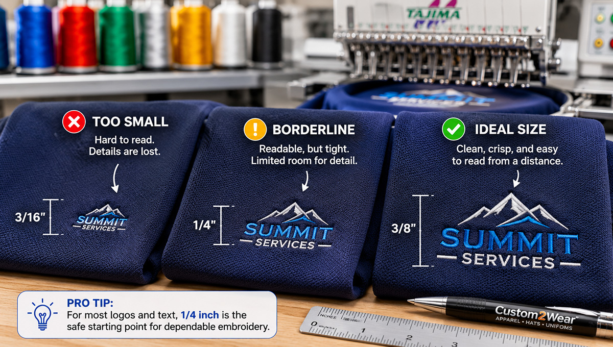
Quick answer: For standard commercial embroidery, lettering should generally be at least 1/4 inch tall for dependable readability. Simple, bold block lettering may sometimes work at approximately 3/16 inch on a smooth, stable garment, but thin fonts, lowercase letters, scripts, outlines, textured fabrics, and hats usually require more room. Lines and small design elements should generally be at least 0.05 inch, or about 1.3 millimeters, thick.
How small can embroidery be before a company name, tagline, phone number, or logo detail becomes difficult to read?
It is one of the most common questions businesses ask when preparing a logo for embroidered polos, hats, jackets, work shirts, and uniforms. A design may look perfectly sharp on a computer screen, business card, or website. Once that same design is recreated with thread, however, tiny letters can close up, thin lines can disappear, and closely spaced details can merge.
Embroidery is not simply a printed image placed on fabric. Every letter, line, and shape must be formed with physical stitches. Thread has thickness, needles require space, garments move during sewing, and different fabrics support detail differently.
This guide explains the practical minimum sizes for embroidered text and logo details, why those limits vary, and how to prepare a business logo that remains clean, recognizable, and professional.
How Small Can Embroidery Be?
For most standard business-logo embroidery, 1/4 inch is a safe starting height for lettering. That measurement should apply to the actual letters—especially the smallest lowercase letters—not just the overall height of the logo file.
Some simple block lettering can be embroidered at approximately 3/16 inch under the right conditions. However, that should be treated as a project-specific possibility rather than a universal minimum.
Small embroidery depends on several factors:
- The font and thickness of each letter
- Whether the text uses uppercase or lowercase characters
- The spacing between letters and words
- The fabric and garment construction
- The logo’s final physical size
- Whether the design is stitched on a flat garment or finished hat
- The number of nearby colors and design elements
- The quality of the embroidery digitizing
A bold, uppercase sans-serif word on a smooth woven jacket may remain readable at a size where a thin script tagline on a textured polo does not.
Minimum Embroidery Text Size at a Glance
| Text or Design Element | Practical Starting Point | Important Considerations |
|---|---|---|
| Bold sans-serif lettering | 1/4 inch tall | Simple uppercase lettering may sometimes work near 3/16 inch on stable fabric. |
| Lowercase lettering | 1/4 inch or larger | Measure the smaller lowercase body, not tall letters such as “T,” “L,” or “H.” |
| Serif or decorative fonts | Approximately 0.35 inch or larger | Small serifs and varying stroke widths can lose clarity. |
| Script lettering | Usually 3/8 inch or larger | Thin loops, tight connections, and small interior openings need additional room. |
| Outlined lettering | Review individually | Both the letter and its border need enough thickness. Small outlined text is often better converted to solid lettering. |
| Lines and narrow shapes | Approximately 0.05 inch thick | Very fine strokes, distressing, and narrow gaps may disappear or fill in. |
| Small lettering on hats | 1/4 inch or larger | The curved surface and center seam make cap embroidery less forgiving. |
These measurements are planning guidelines, not guarantees. Final results still depend on the exact font, garment, stitch file, and logo layout.
Why Computer Font Size Does Not Predict Embroidery Size
Business owners often ask whether an 8-point, 12-point, or 18-point font can be embroidered. Unfortunately, point size is not a reliable way to evaluate embroidery lettering.
Two fonts set at the same point size can have completely different physical dimensions. One may have tall, wide block characters. Another may have thin strokes, short lowercase letters, narrow spacing, and decorative details.
The more useful measurement is the actual height of the smallest letters at the final embroidery size.
For example, consider the company name:
Northside Plumbing
The uppercase “N” and “P” may appear tall enough, while the lowercase letters are much smaller. If the smaller letters are below the practical embroidery limit, the name can become crowded even though the overall text box appears large enough.
This is why a logo should be reviewed at its intended physical size rather than judged by the font settings in Canva, Illustrator, Word, or another design program.
Why Small Letters Fill In
Many letters contain small open areas known as counters. These include the spaces inside characters such as:
- A
- B
- D
- e
- o
- p
- R
- 8
When the lettering is reduced too far, stitches from opposite sides begin to crowd those openings. A lowercase “e” may resemble a solid circle. An “a” may become difficult to distinguish from an “o.” Closely spaced letters such as “rn” may begin to look like an “m.”
The issue is not always the total height of the word. The problem may instead be:
- Strokes that are too thin
- Interior openings that are too small
- Letters placed too close together
- Too much stitch density in one area
- Fabric texture pushing through the lettering
A professional digitizer may enlarge openings, adjust spacing, simplify letter shapes, or use a different stitch approach to preserve readability.
Minimum Line Thickness for an Embroidered Logo
Text is only one part of the problem. Thin lines, borders, small icons, and narrow gaps also have physical limits.
As a practical starting point, important lines and shapes should generally be approximately 0.05 inch, or 1.3 millimeters, thick. Extremely thin hairlines that look elegant on a website may not produce a visible or consistent row of embroidery stitches.
Watch for these common logo elements:
- Thin rooflines in contractor logos
- Small tools, wires, pipes, leaves, or blades
- Narrow borders around letters
- Fine facial details in mascots
- Distressed or weathered textures
- Tiny gaps separating two colors
- Very small stars, dots, or decorative marks
- Thin lines inside vehicle or building illustrations
According to Melco’s embroidery design guidelines, small details and narrow shapes often need to be enlarged or simplified because embroidery is created with physical stitches rather than pixels.
Best Fonts for Small Embroidery
The best fonts for small embroidered text usually have:
- Medium or bold strokes
- Simple letter construction
- Open interior spaces
- Consistent line thickness
- Enough spacing between characters
- Limited decorative detail
Clean sans-serif fonts are generally the safest starting point. Examples of suitable styles include straightforward block, gothic, athletic, and modern sans-serif lettering.
The exact typeface matters less than its construction. A simple font with generous spacing will usually outperform a delicate font with compressed letters.
Fonts that become difficult at small sizes
These styles often need to be enlarged or adjusted:
- Thin scripts
- High-contrast serif fonts
- Condensed fonts with tight counters
- Distressed fonts
- Fonts with rough or irregular edges
- Decorative western or vintage fonts
- Lettering with multiple outlines or shadows
A script font is not automatically impossible to embroider. Connected script can sometimes sew smoothly because the stitching can travel between letters. The problem appears when the script contains very thin strokes, tight loops, small spaces, or excessive flourishes.
Uppercase vs. Lowercase Embroidery
Uppercase lettering is often easier to embroider at a small size because the characters generally have a more consistent height and simpler structure.
Lowercase lettering includes:
- Short x-height characters such as a, e, o, and s
- Ascenders such as b, d, h, and l
- Descenders such as g, j, p, q, and y
A line of lowercase text may therefore occupy a tall overall box while its most important readable portion remains very small.
When a tagline must remain compact, changing it to uppercase may improve embroidery clarity. Another option is to increase the tagline’s width, separate it from the main logo, or remove it from the smallest logo version.
How Fabric Changes Small Embroidery
The same stitch file can look different on two garments because fabric affects how well it supports the stitches.
Smooth woven shirts and jackets
Stable woven fabrics generally provide a clean surface for small details. Work shirts, button-down shirts, and certain jacket materials can often hold lettering better than loose or highly textured fabrics.
Pique polo shirts
Pique polos have a visible knit texture. Small stitches can settle between the raised areas of the fabric, making thin lettering look less defined. For this reason, a 1/4-inch text height is a sensible minimum for most custom embroidered polos.
Fleece and sweatshirts
Fleece, sweatshirt material, and other soft fabrics may require additional underlay or stabilization. Thin lettering can sink into the surface, especially when the fabric has a noticeable nap.
Performance fabrics
Lightweight and stretchy performance materials can shift or pucker if a small area contains too many stitches. The design may need lighter density, stronger stabilization, or reduced detail.
Beanies and textured knits
Beanies and loose knits are among the least forgiving surfaces for tiny details. Lettering that works on a woven jacket may need to be larger, bolder, or placed on a patch before being applied to a knit hat.
Why Small Hat Embroidery Is More Difficult
Finished hats present several additional challenges:
- The front is curved rather than flat
- Many caps have a center seam
- The embroidery area is relatively shallow
- The crown may contain structured backing
- The hat must move through the sewing field differently from a flat garment
Small lettering placed directly over a center seam may sew unevenly or become harder to read. A long company name may also need to be reduced to fit the available width, causing the letter height to fall below the preferred minimum.
That is why a logo that works well on the left chest of a polo may require a separate cap version.
A good hat logo often uses:
- A shorter company name
- A larger central symbol
- Bold lettering
- Fewer words
- Reduced fine detail
- No small tagline
Businesses comparing cap styles can also review our guide to the best custom hats for business and browse available custom branded hats.
Is Your Logo Too Detailed for Embroidery?
A detailed logo is not necessarily a bad logo. It may work beautifully on a website, vehicle wrap, sign, or printed brochure. The challenge is fitting all of that information into a small embroidered area.
Your logo may need an embroidery-specific version if it includes:
- A long tagline beneath the company name
- A phone number, website, and service list
- Multiple thin outlines
- Gradients, shadows, or transparency
- A detailed photograph or realistic illustration
- Very small trademark or registration symbols
- Numerous tiny colors
- Fine distressing or texture
- Small negative spaces between shapes
The goal of simplification is not to redesign the company’s identity. It is to preserve the most recognizable parts of the logo in a format that works with thread.
How a Logo Can Be Simplified for Embroidery
Common embroidery adjustments include:
- Removing a small tagline. The full logo can still be used in print, while embroidery uses the company name and primary symbol.
- Increasing letter spacing. More room between characters prevents neighboring stitches from merging.
- Thickening narrow lines. Hairlines can be converted into visible stitched shapes.
- Opening enclosed areas. Spaces inside letters or icons can be enlarged slightly.
- Reducing colors. Similar shades can be combined into one solid thread color.
- Replacing gradients with solid fills. Thread can suggest shading, but it does not reproduce a digital gradient in the same way as printing.
- Eliminating minor background details. Small decorative elements can be removed while keeping the main logo recognizable.
- Creating separate layouts. A horizontal logo may work on a polo, while a stacked version fits a hat more effectively.
Many businesses benefit from keeping several approved logo formats:
- A full-color primary logo
- A one-color version
- A simplified embroidery version
- A small icon or monogram
- A horizontal version
- A stacked version
This gives the decorator flexibility without changing the core brand.
Should You Include a Tagline, Website, or Phone Number?
It depends on the placement and available space.
A short tagline may work beneath a left-chest logo when the overall design is wide enough to keep the letters readable. A long tagline may force the entire design to become too small.
Phone numbers and web addresses can be especially difficult because they contain many characters. Trying to place a company name, tagline, phone number, website, and service list inside one small chest logo usually creates clutter.
A better uniform layout might use:
- Company logo on the left chest
- Employee name or title on the right chest
- Phone number or website printed across the back
- Simple secondary mark on the sleeve
Our guide to logo placement on shirts and business apparel explains how to divide information across the front, back, sleeves, and other decoration areas.
Can a QR Code Be Embroidered?
A QR code can technically be recreated with embroidery, but a small embroidered QR code is rarely the best choice.
QR codes depend on precise square shapes, consistent spacing, strong contrast, and a clear quiet area around the code. Fabric movement, thread thickness, texture, and small distortions can make an embroidered code unreliable to scan.
For most uniforms, use a printed QR code on a larger, smooth area if scanning is essential. Do not make a QR code the only way customers can find important information.
When a Patch Works Better Than Direct Embroidery
A patch may be a better solution when the logo contains details that do not sew cleanly directly onto the garment.
Depending on the design, businesses can consider:
- Woven patches for smaller lettering and finer detail
- Printed patches for gradients or complex artwork
- Embroidered patches for a traditional dimensional look
- Leather or leather-look patches for bold, simplified branding
Patches are particularly useful on hats, bags, workwear, and outerwear. They provide a controlled decoration surface and can create a premium branded appearance.
However, switching to a patch does not automatically solve every problem. Extremely small text may still be difficult to read, and the patch itself must fit the garment.
When Printing Is Better Than Embroidery
Embroidery is ideal for a durable, professional, dimensional finish. It works especially well for polos, hats, jackets, button-down shirts, and workwear.
Printing may be more suitable when the design includes:
- Large front or back artwork
- Fine lines or small printed details
- Photographic elements
- Gradients and color blends
- Extensive text
- A design that would become heavy if fully embroidered
A business does not have to use one decoration method for every garment. It may use embroidery on company polos, a patch on hats, and printing on branded T-shirts.
Choosing the method that fits each garment usually produces a better result than forcing the exact same decoration process across the entire uniform program.
Why Embroidery Digitizing Matters
Before a logo can be embroidered, it must be converted into stitch instructions. This process is called digitizing.
A digitized embroidery file controls:
- Stitch types
- Stitch direction
- Stitch density
- Underlay
- Color sequence
- Start and stop points
- How different design elements overlap
Digitizing is not the same as automatically converting an image file. Two stitch files created from the same logo can produce noticeably different results.
Small lettering requires careful decisions about spacing, density, stitch length, and sequencing. Simply shrinking a stitch file that was created for a larger design can make the design too dense and cause details to close up.
Business owners generally do not need to provide a machine-ready embroidery file. Send the cleanest logo artwork available. Our guide to logo file types for embroidery and printing explains which AI, EPS, SVG, PDF, PNG, and JPG files are most useful.
How to Evaluate an Embroidery Proof
Before approving a design, check more than the overall logo shape.
Review the proof for:
- The final stated width and height
- The height of the smallest text
- Correct spelling and numbers
- Thread-color choices
- Readable spacing between letters
- Details that were simplified or removed
- The selected garment and placement
A computer proof is useful for checking layout, size, spelling, and color placement. It is still a simulation. Thread texture, fabric, lighting, and stitch direction mean the finished embroidery will not look exactly like a flat digital image.
For a new logo, a difficult garment, or an especially detailed design, a physical sew-out may be helpful before a large production run.
Embroidery-Ready Logo Checklist
Before requesting custom embroidered apparel, gather the following information:
- The highest-quality logo file available
- The apparel item you want decorated
- The intended logo placement
- The approximate quantity
- The desired garment colors
- Your required delivery date
- Brand-color information, if available
- Any text that cannot be removed
- Permission to create a simplified embroidery version if necessary
Then review the logo itself:
- Is the smallest lettering at least approximately 1/4 inch tall?
- Are the letters bold enough to form with thread?
- Are small interior spaces open?
- Are important lines approximately 0.05 inch thick?
- Does the design contain gradients or tiny shadows?
- Is there more text than the decoration area can comfortably hold?
- Will the same logo need separate hat and shirt layouts?
The Best Embroidery Is Designed for the Garment
The question is not simply, “How small can embroidery be?” A better question is:
How small can this particular logo be on this particular garment while still looking professional?
A simple block-letter company name may sew cleanly at a relatively small size. A detailed logo with script lettering, a tagline, multiple outlines, and a complex icon will need more room.
Good embroidery preserves what customers need to recognize: the company name, primary symbol, and overall brand character. Removing an unreadable tagline or thickening a narrow line often makes the final garment look more faithful to the brand—not less.
Not Sure Whether Your Logo Will Embroider Cleanly?
Custom 2 Wear helps businesses prepare logos for embroidered polos, hats, jackets, workwear, uniforms, and other branded apparel. Send us the best logo file you have, along with your preferred garment, quantity, placement, and deadline.
We can review the lettering, details, and layout and recommend embroidery, printing, a patch, or an adjusted logo version.
Frequently Asked Questions About Small Embroidery
What is the minimum text size for embroidery?
For most commercial embroidery, use a minimum lettering height of approximately 1/4 inch. Simple bold block text may sometimes work near 3/16 inch on smooth, stable fabric, but hats, textured fabrics, scripts, serifs, and thin lettering generally require a larger size.
What is the smallest font size that can be embroidered?
Computer font size is not a reliable embroidery measurement because different fonts have different letter heights and stroke widths. Measure the actual smallest letters at the final physical size. Approximately 1/4 inch tall is a dependable starting point.
Can small lowercase letters be embroidered?
Yes, but lowercase letters can be more difficult because their main body is shorter than uppercase letters. Openings inside letters such as “a,” “e,” and “o” may close when the text becomes too small.
What fonts work best for small embroidery?
Simple sans-serif fonts with medium or bold strokes, open spaces, and generous letter spacing usually work best. Thin scripts, delicate serifs, distressed fonts, and tightly condensed lettering generally need to be enlarged.
Why was the tagline removed from my embroidered logo?
A tagline may be removed when fitting it into the available area would make it too small to read. The primary company name and logo symbol can remain, while the complete logo continues to be used for printing, signs, websites, and larger applications.
Can the same logo file be used for hats and polos?
The same source artwork can be used, but the embroidered layout may need to change. Hats have a curved, shallow decoration area and often a center seam, so long text and small details may need to be enlarged, stacked, or removed.
Can a detailed logo be embroidered?
Many detailed logos can be embroidered after they are simplified for thread. Thin lines may be thickened, gradients converted to solid colors, small gaps enlarged, and minor details removed. Printing or a woven patch may be better when fine detail is essential.
How thick should lines be for embroidery?
Important lines and narrow shapes should generally be approximately 0.05 inch, or 1.3 millimeters, thick. The exact requirement depends on the stitch type, garment, and surrounding details.
Can an embroidered QR code be scanned?
Some large embroidered QR codes may scan, but small codes are unreliable because fabric texture and thread can distort the required squares and spacing. A printed QR code is usually a better choice when dependable scanning is important.